
Steam Mobile

Project Overview
Project Length: 2 months
Goal: How Might We help our users more easily view and manage their time in the most intuitive and convenient way?
My Role: Lead UX/UI Designer
Team: Emi Jackel, Gage Brouse, Jasmine Banman, Finn Larson

Understanding The Problem
To gain a deeper understanding of the user experience, we conducted eight interviews with five experienced Steam users, where we explored recurring frustrations, and three with individuals new to the platform. For the latter group, we used observational methods to assess how users navigated the onboarding and log-in process.
In addition to interviews, we analyzed hundreds of App Store reviews rated three stars or below to identify broader usability concerns shared by the community.
Organizing Users Thoughts
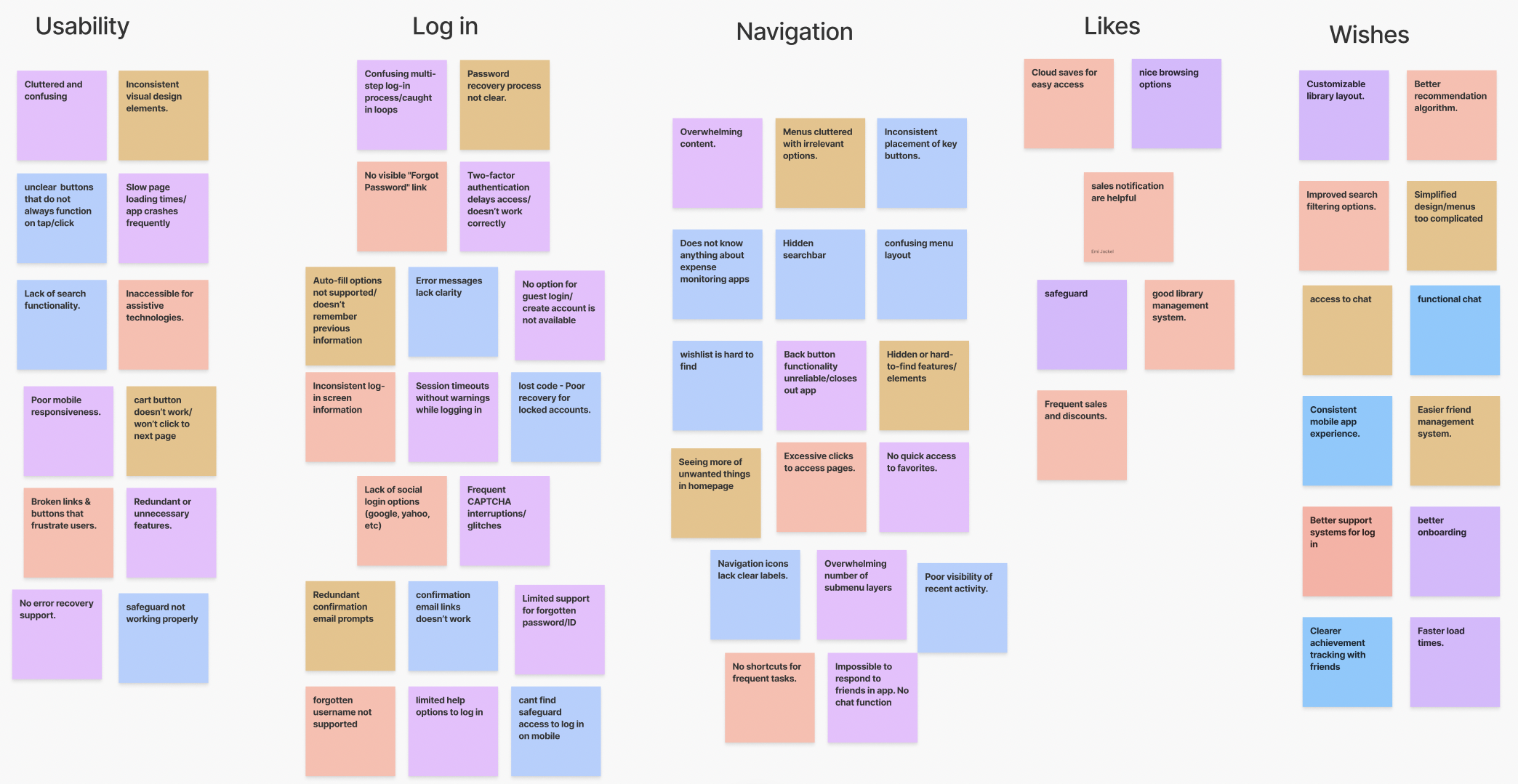
We created a map to help us make sense of our interviews, where we started to notice a few patterns:
Navigation challenges: Users struggle to locate basic features, leading to frustration and app abandonment.
Log-in process is broken: The log-in system is unreliable, with repetitive verification loops preventing access for some users.
Lack of social features: The app lacks essential communication tools like chat integration, making it difficult for users to connect with friends and respond.
Getting To Know Our Users
We wanted to better understand the common issues and situations that people face while trying to use the Steam app. Creating User Personas was a helpful way for my team and I to synthesize our findings into a clear snapshot of our target users and to help us maintain our focus during design discussions, asking questions like: “Would Alex, a busy college student, actually use this feature?”


Imagine This Scenario…
You are a busy working professional, working 40-50 hours every week. On your sacred days off you like to first go to the gym and then relax and spend a few hours playing games with friends. On your way home from the gym, you open up the app and see your friends online. Then, oh no! Steam Mobile is telling you to download their separate messaging only app.
Social connection is at the heart of Steam, and need to be in sync! A good mobile app should be able to manage both.
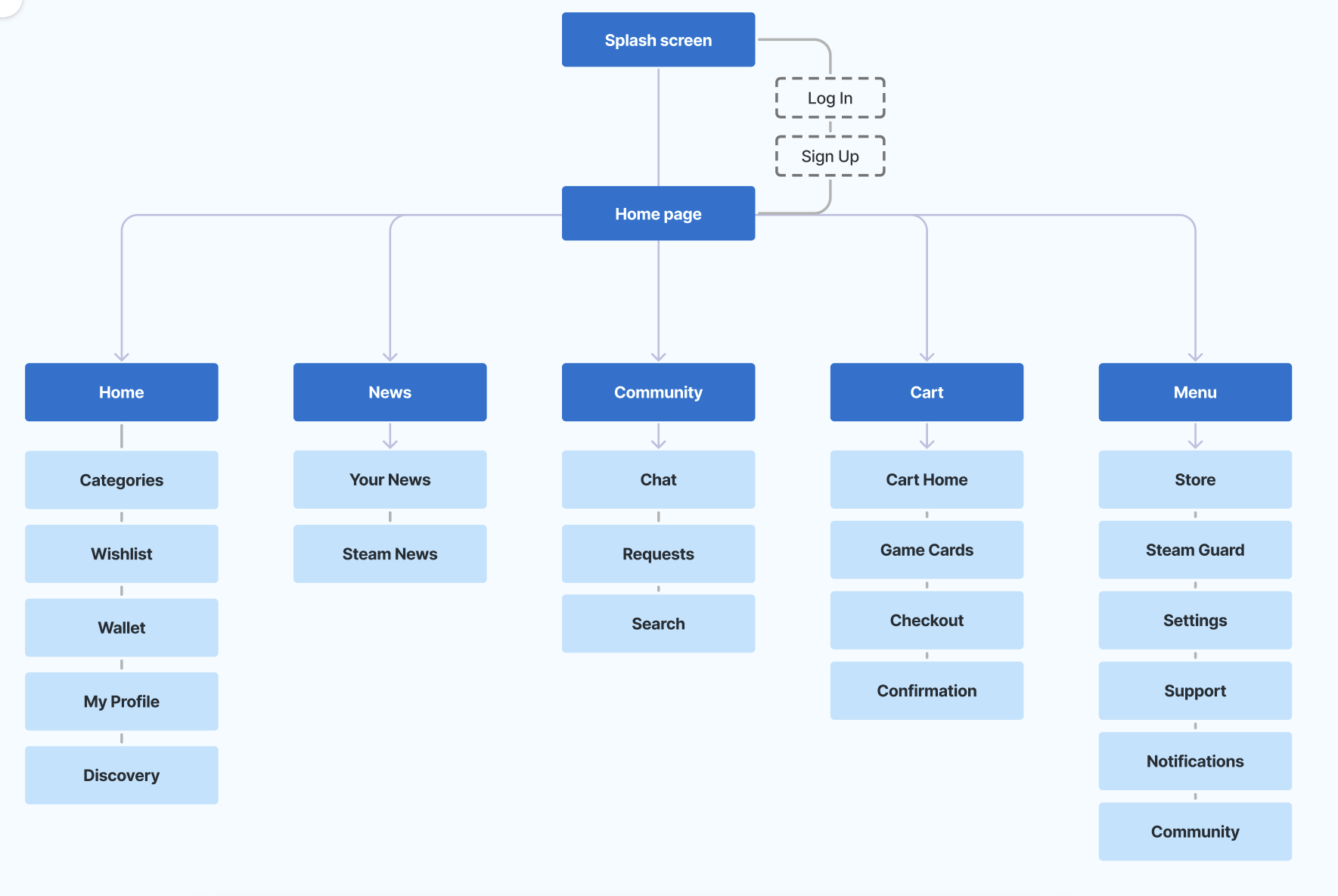
Information Architecture
Before jumping straight into design, we wanted to build a better app structure. Since people navigate an interface differently, I was responsible for providing a clear information system tailored to as many different types of people as possible.
Utilizing the Principle of Choices, I wanted to make sure that users never felt overwhelmed by too many choices when navigating the app. Instead, I chose to limit the number of options available at any given time by consolidating any redundant information.
Creating this diagram helped us to have a much better idea about the effort needed to design all of the screens and begin to address certain navigation problems that have been mentioned throughout negative app reviews. By creating this diagram, we were able to effectively organize the Steam UI in a more logical way to help the user more easily find what they need.
Initial Designs
The first problem we wanted to solve was the log-in error. Many users have reported that they will get stuck by being locked out due to a faulty Steam Guard authentication process loop.
To fix this issue, we decided to provide secondary way for users to log back into their account using an OTP flow.

Next, we designed the rest of the key screens. Throughout our research, we realized that the Steam Guard icon in the navigation bar should be added to the far-right List tab, since it isn’t as frequently used since most users stay logged in.
In place of the Steam Guard tab on the navbar, we modified the Community tab, where chat, friend requests, and friend searches are consolidated into one page.
Alternative Log In and Account Recovery with OTP

Key Screens: Home, Wishlist, Wallet

Key Screens: News, Community, Cart, More

All-In-One App Solution
Insights from user research indicated that Steam users desire better organization and a streamlined chat interface. By combining Steam Messaging with Steam Mobile, users can focus on achieving their goals easier and faster than before.
Results
At the end of our UX course and semester, we compiled a report to Utah State University’s Human Experience Design & Interaction department head, complete with all of our research findings and the interactive Figma prototype.
We successfully presented our project for the Fall 2024 UX/UI Design course, earning top marks and recognition for both creativity and execution. I learned a lot from this project about information hierarchy and app creation, and I also worked on soft skills for collaborating with cross-functional teammates and communicating with users during testing.
Next Steps
Looking back, I’m proud of the progress my team and I made redesigning the Steam app, but I recognize there is still a lot of room to grow. If I were to revisit this project, I would really love to dive even deeper into testing, especially with a larger user base. While we gathered great insights from our initial interviews, more rounds of usability testing would have helped us improve some of the smaller interactions and validate some of our later-stage design decisions.
I would also push to explore the onboarding process a bit more, specifically for brand new users. Our current solution in this project focused on the returning log-in experience alone, but throughout this process I have learned there is a great opportunity to help make day one users feel more welcomed.
I’m always growing as a designer, and this project was a great reminder of how powerful UX research/design can help improve peoples digital experiences! I'm super excited to carry these lessons into my future projects. I know this was a long one, so thanks for reading!